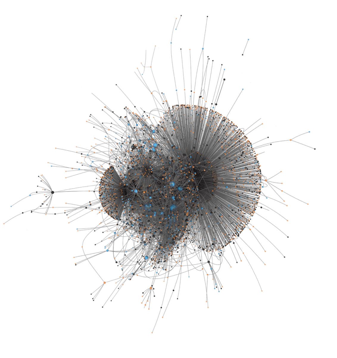
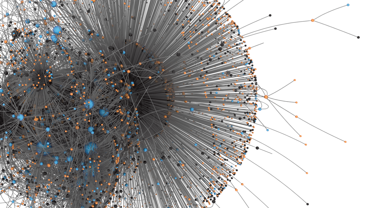
The BarábasiLab chose to map the spread of the Pizzagate scandal because it was the first well documented fake news event—the debunked right-wing conspiracy theory was traced to right-wing conspiracy website Infowars—that affected the 2016 US election landscape. What the Fake News network actually depicts is the spread of tweets sharing the #pizzagate hashtag on Twitter. By 2016, a substantial amount of activity on Twitter was generated by bots, program-driven accounts that pose as humans. To show the important role such bots play in the propagation of fake news, Barabasi’s team evaluated each Twitter account that retweeted #pizzagate using a Botometer, an artificial intelligence tool that separates humans from bots. The number of bot tweets versus human tweets in spreading Pizzagate are represented on the map by node color—the bots are shown in ocher-colored nodes, the humans in teal.
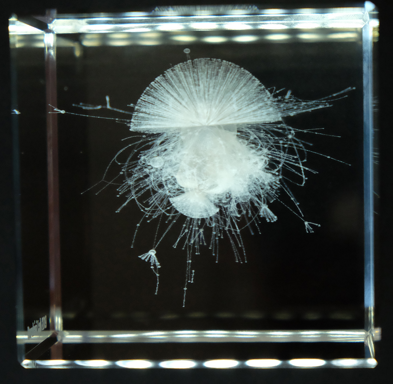
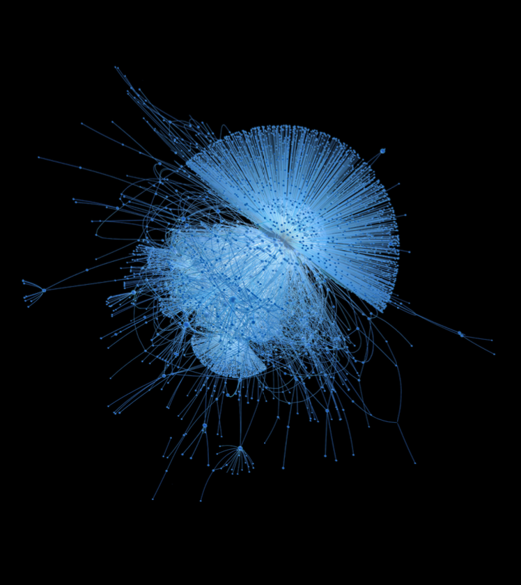
The Fake News network was conceived as a potential data sculpture and created as part of the Wonder Net project, the first public release of several data sculptures. At the time, however, the 3-D printing technology lacked the resolution to sufficiently articulate the structure’s fine details. Instead, the BarabásiLab produced this map in two other mediums, first as a 2-D monochromatic print and then as a laser-engraved glass etching, a medium used by the BarabásiLab to represent 3-D networks with exceptional complexity.


Contact
Social